|
|
2022
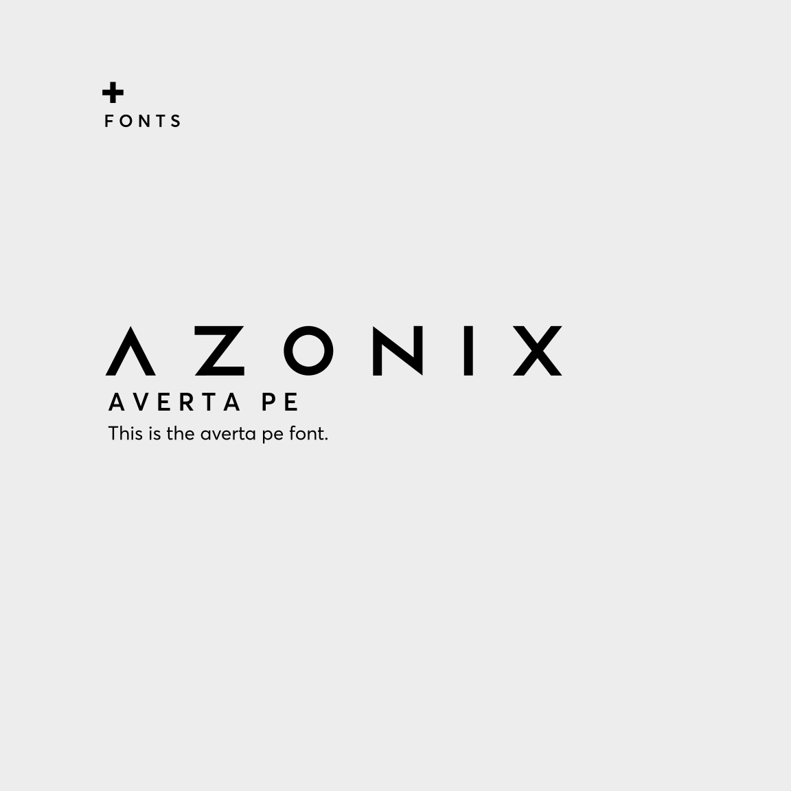
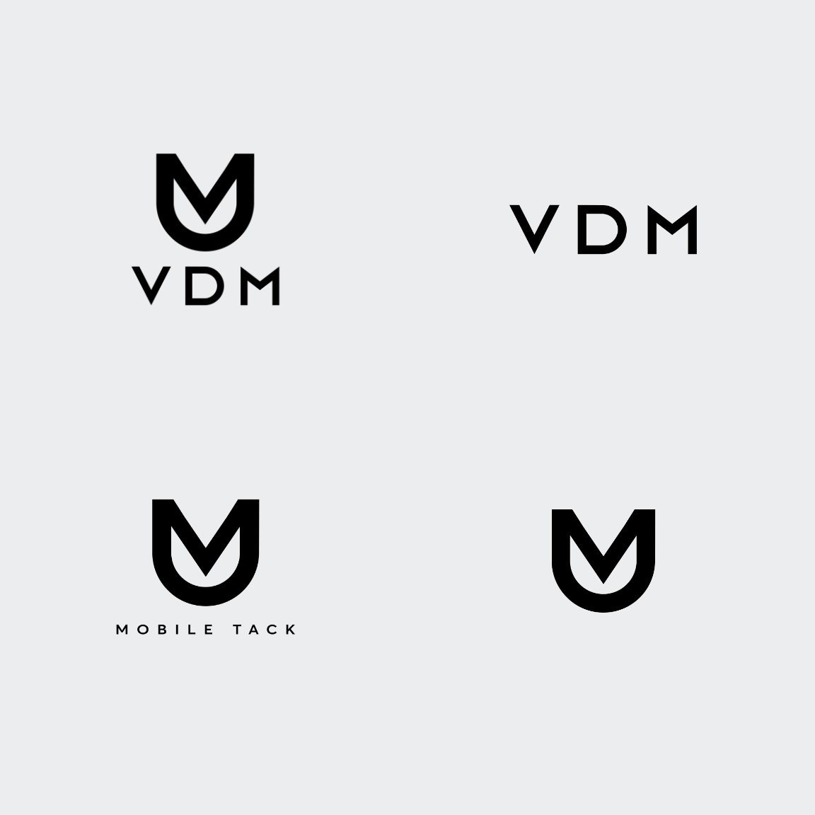
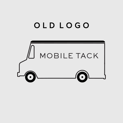
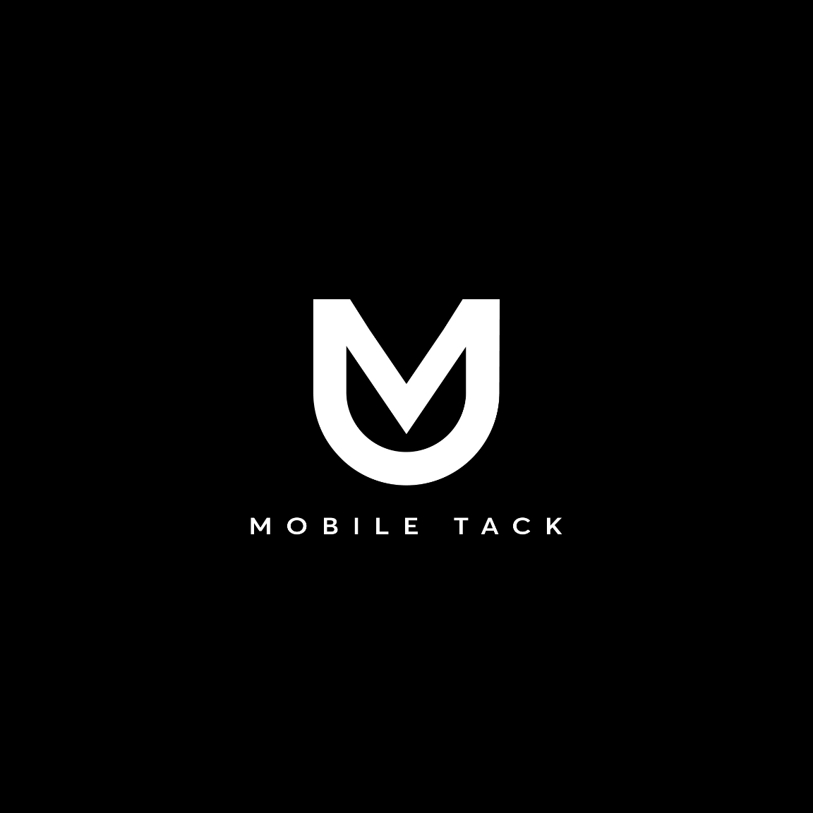
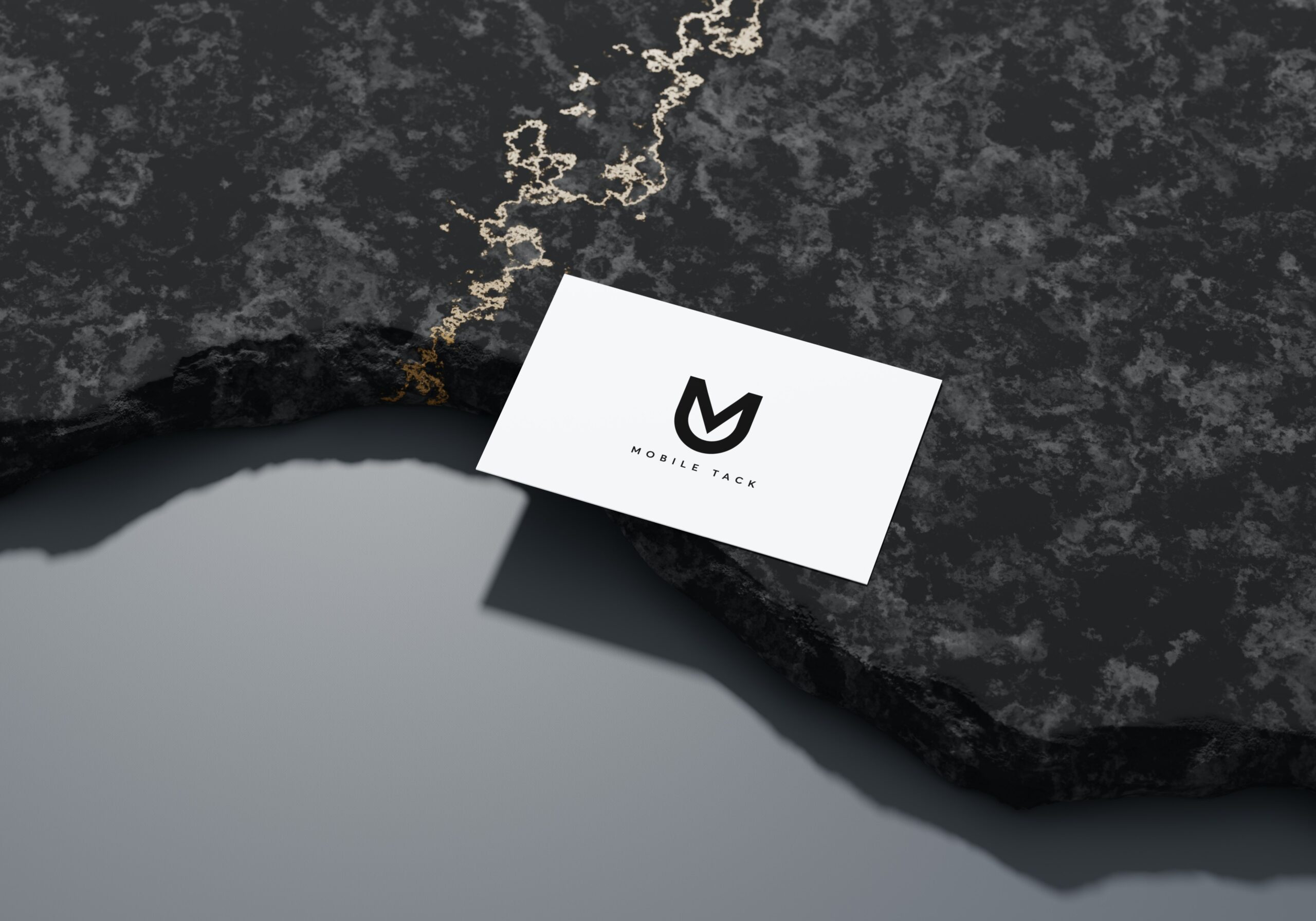
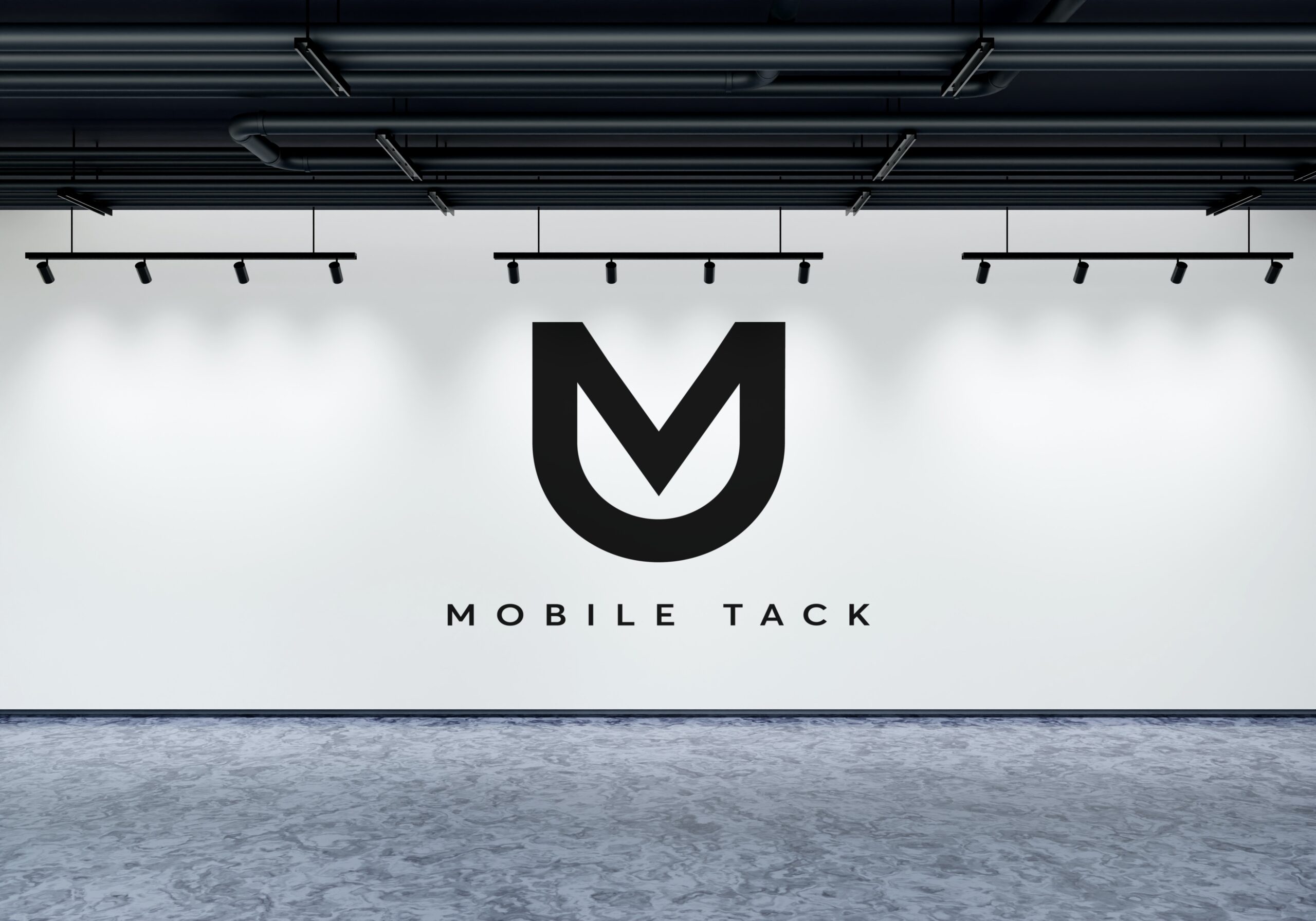
We worked with Mobile Tack LLC to rename and rebrand their specialized and luxury mobile tack service. We created the name VDM Mobile Tack to give a unique identifier to the brand, and set it apart from other mobile tack companies. As the VDM represents the name of the owners, we also incorporated their heritage, their background, their initials, and their service industry into one compact and iconic logo. As the founders are from the Netherlands, we created the letters V, D, and M into a symbol of a tulip, that represents the flower of the Netherlands. The iconic logo also is shaped similar to a horses head, with the ears at the top, as well as looking like a horse shoe from above. We also put together a brand kit that is equipped with fonts for headlines, subheadings, and body copy, that can be used within any future branding materials. This brand screams iconic, while simultaneously appearing elegant and understated.

To provide the best experiences, we use technologies like cookies to store and/or access device information. Consenting to these technologies will allow us to process data such as browsing behavior or unique IDs on this site. Not consenting or withdrawing consent, may adversely affect certain features and functions.