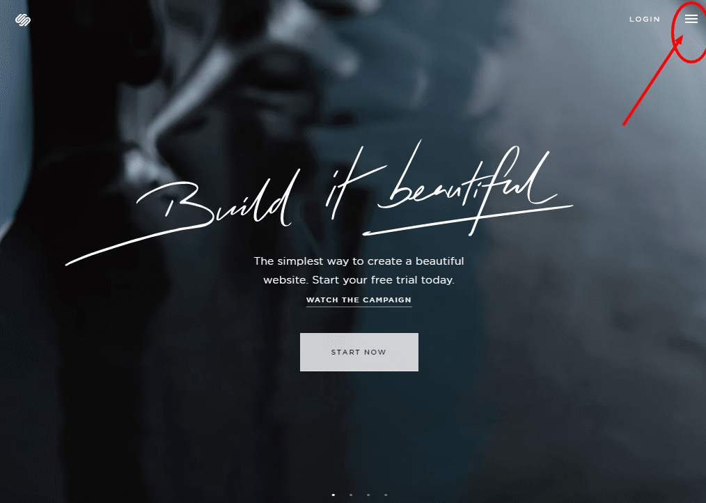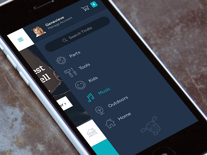
Known as the ‘hamburger menu’, the collapsible menu with three horizontal lines can be a blessing and a curse to the digital world, depending on the application in which it is used. The hamburger menu is one of the website design trends of 2017 that has been a setback to an ideal UX design. In a mobile application or mobile website design, the hamburger menu is a major breakthrough for User Experience (UX). However, the hamburger menu integrated into a desktop website design is one of the biggest mistakes in regards to user experience.
1. It looks sleek and user friendly, but the data says otherwise.
There is no doubt that the click-to-open navigation menu on a desktop looks absolutely beautiful and really simplifies the website design. It frees up plenty of open space in your header, and creates a neat and organized feel. As a website design agency, we understand why the click-to-open navigation is so awesome and sleek, but we also understand that using a mobile-style navigation on a desktop most likely will have its setbacks. We know that using a hamburger menu in your desktop website navigation WILL repel conversions and WILL create chaos in User Experience (UX). Even UX Planet agrees that a hamburger menu is a “conversion killer”. We did A/B testing on this website, and we found that the standard horizontal menu for desktops increased conversion by 150% in the first month!
2. Too many clicks needed to navigate the website.
According to The Atlantic, the hamburger menu “does in fact, make the navigation items less discoverable”. Creating an icon that needs to be clicked first in order to open up the website navigation is creating an unnecessary “extra step” that a user needs to make in order to navigate. Further, these types of navigations are usually out of sight of the viewer, and so, the user cannot even see what other menu items are available, while hidden under your icon-based, click-to-open navigation.
3. It can be confusing for many users.
Depending on your target audience, knowledge of technology and web-design trends may not work in your favor. Unlike you (a person with knowledge in technology or website design trends), many people searching for your products or services online may not be as in-tune with how to use your click-to-open navigation. Because of this, your website will most likely be considered too confusing to navigate, and in turn, the user will leave earlier than you had anticipated.
4. It drastically reduces website conversions.
If your goal is to create a beautiful display website or a portfolio website that you have no intentions of converting visitors into leads or clients, then the hamburger menu will improve the aesthetics of your website without much failure elsewhere. However, if you are selling a product or service, your overall goal is to convert users into customers or leads. It is been statistically proven that the hamburger navigation does in fact decrease conversion rates. For example, on our website, we tried the fancy hamburger menu for a period of 6 months, and then re-designed the navigation to a standard horizontal navigation bar. The difference in leads had increased over 150% in the first month! If your goal is to produce leads and customers, remove your click-to-open website navigation now!
5. Inconsistency of industry-wide usage.
All of the points above correlate directly to this point: that the consistency of the hamburger menu usage has not been standardized, and so, users have not been “trained” to know where they are and how they work. Sometimes you’ll find these menus at the top left, top right, in the middle, floating around, and sometimes even the icons are modifications of the hamburger menu (i.e. the slashed hamburger menu). Since there are so many variables involved with how these menus are used throughout the industry, many people are not acclimated to where to easily find them and how to use them. Unlike you, many users are not familiar with website design trends, and so you need to adjust to them!
Conclusion.
To conclude, the decision to use a hamburger menu navigation on your desktop website should be based on the nature of your website, the tech-savviness of your audience, and the goal your website is trying to achieve. If you are creating a display website to simply show the world how cool your designs are, then this style of navigation can be a great addition to your header. If you are creating a website with a purpose that involves collecting leads, selling products, selling services, or funnels, then you should probably avoid the hamburger menu navigations altogether. As a website design and development agency, we love the look of hamburger navigation, but we can’t overlook the extraordinary amount of data that correlates to the use of these navigation styles and user experience.